


 2023 is set to be a defining year, so it’s no surprise that the Pantone Color of the Year embodies boldness and daring. The world of advertising and branding is always evolving, and Pantone Color Institute is at the forefront of this change. Every year, Pantone, a company that specializes in color matching and printing, announces its Color of the Year. This color is meant to represent the cultural spirit of the age and provide inspiration for designers, artists, and advertisers around the world.
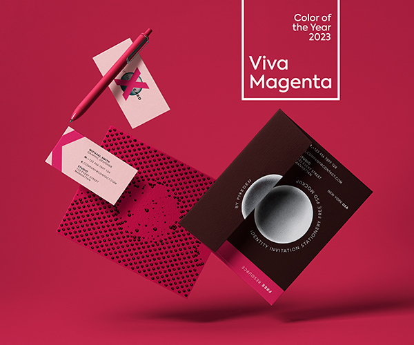
In 2021, the color of the year was Ultimate Gray and Illuminating, which created a bright and cheerful atmosphere. For 2023, they have announced the new color of the year: Viva Magenta.
Viva Magenta and the Psychology of Color in Advertising
Viva Magenta is a vibrant and powerful hue, a perfect combination of red and purple. This powerful color draws inspiration from nature to express modernity and courage, reminding us of the sunny days ahead. It is the perfect color to represent the energy and confidence of the new decade. As Pantone Color Institute said,
“Viva Magenta is a passionate and lively hue, evoking the spirit of exploration, ideas, and creative solutions.”
The bold, vivid hue of magenta has always transcended advertising and marketing, from the ruby red of Coca-Cola to the pink of Max Factor. Viva Magenta takes color psychology to a new level. It eliberately utilizes its psychological effects on consumers to encourage positive feelings associated with the product. The psychology of colors in advertising is a truly fascinating field! Colors can act as powerful emotional triggers for the audience, with different shades implying different messages. From blues that elicit feelings of trustworthiness to vibrant yellows and oranges that elicit excitement, brands around the world use color to engage their target audiences. This is what influences their buying decisions. If one understands how colors interact with biological responses, they can create powerful messages and visuals that capture people’s attention. The powerful qualities associated with magenta are used to inspire unique ideas. It creates an association between the colors and desired outcomes. This can be about success or wealth. Viva Magenta can profoundly influence consumer perception, if you apply strategically within advertising campaigns.
From Logos to Campaigns: How Brands are Using Viva Magenta
Viva Magenta is quickly gaining popularity among brands across a range of industries. The strong hue of magenta stirs emotions like passion, excitement and energy that help attract attention amidst a sea of competing advertisements. From fashion to tech to food, companies are incorporating this bold and vibrant shade of pink into their logos, advertising campaigns, and brand identities. As an example, you have probably noticed how Uber also incorporated Viva Magenta into its branding. You may come up with the color prominently in the company’s mobile app. It helps create a sense of excitement and urgency for users. Even the classic toy brand Barbie has incorporated Viva Magenta into its branding. The color is for product packaging and marketing campaigns, and it helps create a sense of fun and creativity for kids and adults alike.
This vibrant color brings a sense of energy and enthusiasm to any project, helping companies stand out in the crowd. It draws attention without being distracting and allows brands to showcase their enthusiasm for any idea or product.
Tips and Tricks For Incorporating Viva Magenta Into Your Brand
Viva Magenta is a vibrant color for adding an exciting touch to your brand. Here are some tips and tricks for incorporating this eye-catching hue into your company’s identity:
- Business Cards: Viva Magenta may be that accent color on your business cards to draw attention to your logo or contact information. Consider using it for your company name or logo and pairing it with a complementary color for the rest of the card.
- Brochures: Viva Magenta can help you highlight key information in your brochure, such as product benefits or pricing. Consider using it as a background color for a section of the brochure or as a border around important information.
- Posters and Flyers: Use Viva Magenta to create eye-catching posters and flyers that will stand out in a crowded market. The color will help you highlight the main headline or call-to-action. Try pairing it with complementary colors for the rest of the design.
- Packaging: Consider using Viva Magenta as a primary or accent color in your product packaging to create a unique unwrapping experience for your customers. This color is perfect for product names or as a background color for the packaging.
- Direct Mail: Use Viva Magenta on direct mail pieces to draw attention to the envelope or to highlight key information inside. The color can be a great option for outlining the return address or as a background color for the envelope.
By incorporating Viva Magenta into your printed marketing materials, you can create a bold brand identity. The combination of brightness, energy and radiance symbolizes recovery from challenging times – something we can all embrace in 2023.


")


")
")


