


Silhouette of a man in color RGB. Concept on the topic of psychology, science, symbol of the complexity of a person’s personality. A creative idea in the colors of RGB.
Colors are everywhere! We see them when we wake up and we see them even in our dreams. Colors help evoke emotions, convey messages, and even capture attention. But did you know that there is a science behind color and how it appears on printed materials? In this blog, we will explore the magical world of color: color in printing and how you can use it to your advantage, with a particular focus on the CMYK and RGB color models.
The Untold Power of Color Psychology
Well, well, well, let’s talk about the power of color psychology. We all know colors evoke different emotions and feelings. Like how blue is the color of calmness and trust while red is associated with passion and excitement. With color psychology, businesses strategically use colors to influence consumer behavior. For instance, fast food chains tend to opt for colors like red and yellow to create a sense of urgency in their customers. On the other hand, luxury brands focus on black and gold as it creates an aura of elegance and sophistication. The bottom line is that colors have an incredible impact on human emotions and behaviors.
Understanding the psychological effects of color is a top skill for marketers, designers, and artists alike to create strong emotional connections with their audiences. Harnessing this knowledge allows for the intentional use of color in branding initiatives, interior decor schemes or even personal fashion choices that can help elicit desired behavioral responses from those around us. So be mindful of your color choices when trying to make a lasting impression!
How to Apply Different Color Models For Appealing Results
To achieve perfect color results, it is important to understand the different color models available and how they work. To help us better see the picture, Ani, one of AxiomPrint top designers, shares her view on the application of color models:
“As a designer, I am absolutely thrilled to explore the world of RGB and CMYK models! These two color formats are absolutely essential in digital design, and knowing how to use them properly can make all the difference in producing stunning visuals. RGB ( red-green-blue) is perfect for creating vibrant images on screen, while CMYK (cyan-magenta-yellow-black) is ideal for print materials. One must understand the differences between these two formats; otherwise, their designs may produce off-color printing or appear dull on a website.”
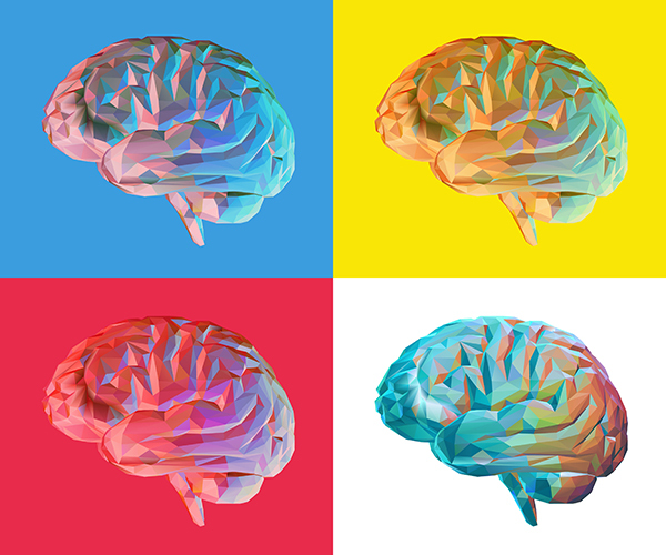
Colorful low poly brain illustration isolated on retro pop art background style
To our question on how to select and combine right colors, Ani continues:
“When selecting colors, take into account their contrast with other elements on the page and consider using a color wheel to complement or highlight specific hues. Remember to always test your colors in various lighting environments as well to ensure they appear consistent across all media types.”
Well, color choice is a complex task that requires a combination of artistic, psychological, and technical skills. Designers need to have a deep understanding of color theory, color psychology, and color models to create designs that are visually appealing, effective, and consistent.
Common Color Printing Mistakes to Avoid
Not all designers or printing masters are perfect at achieving accurate and consistent color reproduction. We know how challenging it can be! Let’s discuss some common color printing mistakes that designers should avoid to ensure that their designs look their best when printed:
Not calibrating your monitor: The colors on your computer screen may look different than the colors on your printed materials. This is because monitors are backlit, while printed materials reflect light. To avoid this problem, it’s essential to calibrate your monitor regularly to ensure that the colors you see on your screen are accurate.
Using low-resolution images: These images can result in a pixelated and blurry final product. Designers should always use high-resolution images to ensure that the final printed output looks sharp and clear.
Choosing the wrong paper type: The type of paper you choose can significantly affect the appearance of your printed materials. Glossy paper reflects more light and is ideal for printing photos and images with bright colors. Matte paper, on the other hand, absorbs more ink and is better suited for text-heavy documents.
Checking for color accuracy: Designers should always check for color accuracy before sending their design to print. They can do this by printing a test print or using a color management tool to preview the final output. Not checking for color accuracy can lead to inaccurate and inconsistent color reproduction, which can result in a disappointing final product.
Coming to the end of our blog we should confirm that color psychology is a very fascinating field! By understanding the influence of different colors on our mood, behavior, and perception, we can make more informed choices about the colors we use in our everyday lives. Whether in fashion, interior design, or marketing, color psychology can be a powerful tool to create the desired impact and achieve our goals.

")


")
")


")