


Pantone Colors of the Year 2021
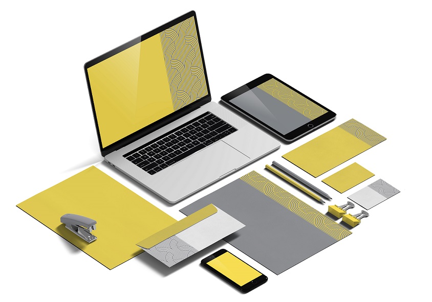
 As you know, last year’s choice was a classic blue, meant to convey reassurance as we entered a new decade…before COVID-19 spread globally. This year, Pantone selected two colors for 2021: 17-5104 Ultimate Gray + 13-0647 Illuminating.
The Pantone Institute has a big task every year…it is not just about selecting a color, but researching and forecasting trends in many industries (fashion, beauty, interior decor, etc.).
This is not the first time two colors have been chosen. But it is only the second time in the past 21 years. This is the first time for Pantone to pick an achromatic color, a shade not using color but only a gradient of black and white. Some critics believe Pantone played it safe and didn’t quite know how the year was going to turn out. So they picked two colors.
Laurie Pressman, vice president, and Leatrice Eiseman, executive director, of the Pantone Color Institute, believe otherwise:
“The union of an enduring Ultimate Gray with the vibrant yellow Illuminating expresses a message of positivity supported by fortitude. Practical and rock solid, but at the same time warming and optimistic, this is a color combination that gives us resilience and hope. We need to feel encouraged and uplifted; this is essential to the human spirit.”
Regarding color association, yellow often elicits happiness or joy. Gray, on the other hand, is usually associated with negative emotions like fear or sadness. Pantone believes that they picked a mid-gray which can be more subjective, since it is not a “heavy” hue. Gray when used in fashion or jewelry is often associated with resilience or strength which is why they selected it.
However, the key is to not see these two colors separately, but together.
Pantone believed it goes to show that even these two colors that are so different from one another can be harmonious. In a world increasingly polarized and the pandemic still spreading, we need to focus more on solidarity and togetherness. We think Pantone is onto something…hopefully we will apply this to all aspects of our lives.


")
")
")


")

